QoS: Quality Monitor widget on the Overview dashboard
Last updated on February 14, 2022
The Quality of Service (QoS) report allows you to filter data by a variety of criteria. Filters allow you to customize your report to only include specific data. The filters are located beneath the top navigation bar. They are dropdown fields that let you choose the data you want the report to show.
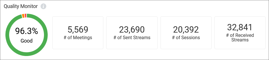
Quality Monitor helps you track the overall quality and volume of Video meetings or calls across your account. On the right side of the widget, depending on whether the upper right toggle is set to Video or Phone, you can see usage of across your account updated near real time:
- Total number of Video meetings or calls across your account
- Total number of sent streams or internal calls
- Total number of sessions within those meetings or of inbound calls
- Total number of received streams or outbound calls
The circle graph, sometimes called a donut, shows quality as a percentage of total streams/calls, showing the percentage of good, moderate, and poor quality. Hover over any part of the colored circle to see details for that section. Good connections are represented by green, moderate by orange, and poor by red, with good connections showing by default. When you hover over any color, the others become shaded.
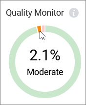
In the example, there were 5,569 meetings, with 20,392 separate sessions/connections. There were a total of 23,690 streams, 96.3% were of good quality. Hovering over the orange section of the graph shows 2.1% were of moderate quality.
© 1999 - 2022 RingCentral, Inc. All rights reserved.